Mixed reactions have continued to trail Manchester City's new away kit but i think it is cool. see what the club had to say about it on its website, mancity.com.
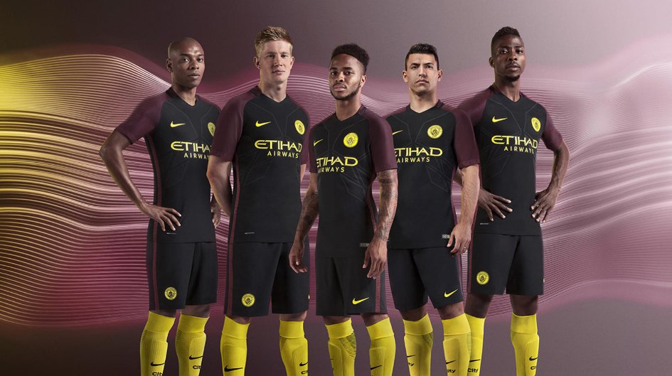
Inspired by the iconic red and black striped away kit of the 1960s, both colours return to City’s change strip for the first time since the unforgettable 2011/12 title winning season.
The 2016/17 instalment also includes a Manchester icon, with the yellow detailing referencing the worker bee, which has been synonymous with the City of Manchester since the Industrial Revolution and has featured on the city’s coat of arms since 1842.
As a nod to the bee’s eye-catching stripes, vibrant yellow detailing, including a reimagined version of the new club crest, embellish our new away kit’s distinctive black body and red shoulder and sleeves.
As with the 2016/17 home kit, the alternate also has two tributes knitted into the design: the word “City” at the back of the collar, and, on the inside of the cuffs, “Est. 1894” feature as another reminder of the club’s storied history and reference to the new badge.

Post A Comment:
0 comments: